An Open Data Platform for Vital Strategies - a global public health organization
Key facts
Service providers:
Datopian
Client:
Vital Strategies
Services:
Data Engineering, CKAN Development, CKAN Features, CKAN Consultancy, CKAN Hosting & Support
Period:
November 2017 - present
Work we've done:
Vital Strategies Platform
The project offers a compelling case for how open data portals can provide easy access to data-driven insights, helping organizations to advance public health policies and practices worldwide.
Main technologies & tools used
Context
Vital Strategies is an international nonprofit that assists governments by designing easily scalable solutions to address the many challenges found in—and around—public health. These public health systems can cover a wide range of areas related to health. From food safety regulations, to handling the data that leads to creating those regulations and policies. Their main mission is to:
work in partnership to reimagine evidence-based, locally driven policies and practices to advance public health.
They work with governments all over the world, with offices in:
- New York, United States
- Addis Ababa, Ethiopia
- Paris, France
- Jinan, China
- São Paulo, Brazil
- New Delhi, India
- Singapore
The situation
The purpose of this project was to build a portal with the tools to help users easily access and visualize public health data. A common problem with large quantities of data is often a lack of accessibility. This project was born out of the need to improve that, and to allow the public, researchers, and government officials to focus more on their own work and goals (and less time on searching for—and visualizing—data).
The criteria
The criteria for this project were clear, minimal, and focused. The two main requirements were:
- compelling, visually-rich dashboards presenting data-driven insights on broad topics
- easy-to-navigate Query Tools to quickly answer questions with data, using multiple forms of visualizations
The solution
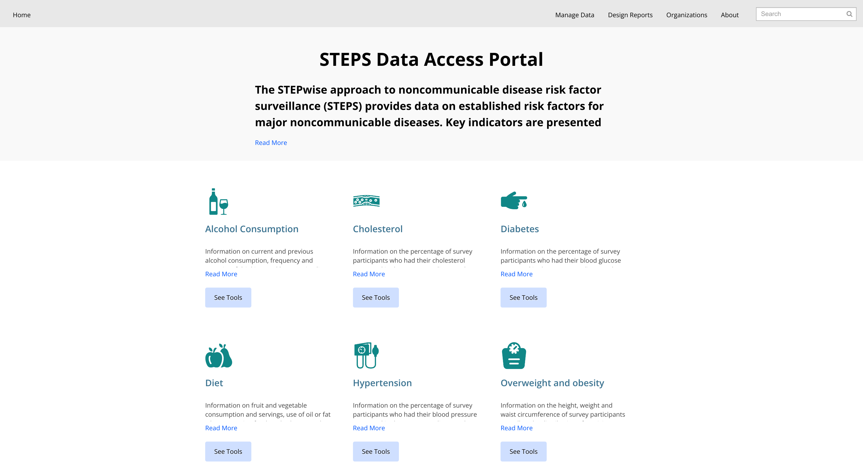
To improve navigation and improve accessibility, customizations were implemented to override the default CKAN UI. The home page is now minimal and focused for both admins and public users, only displaying the groups found on the portal:

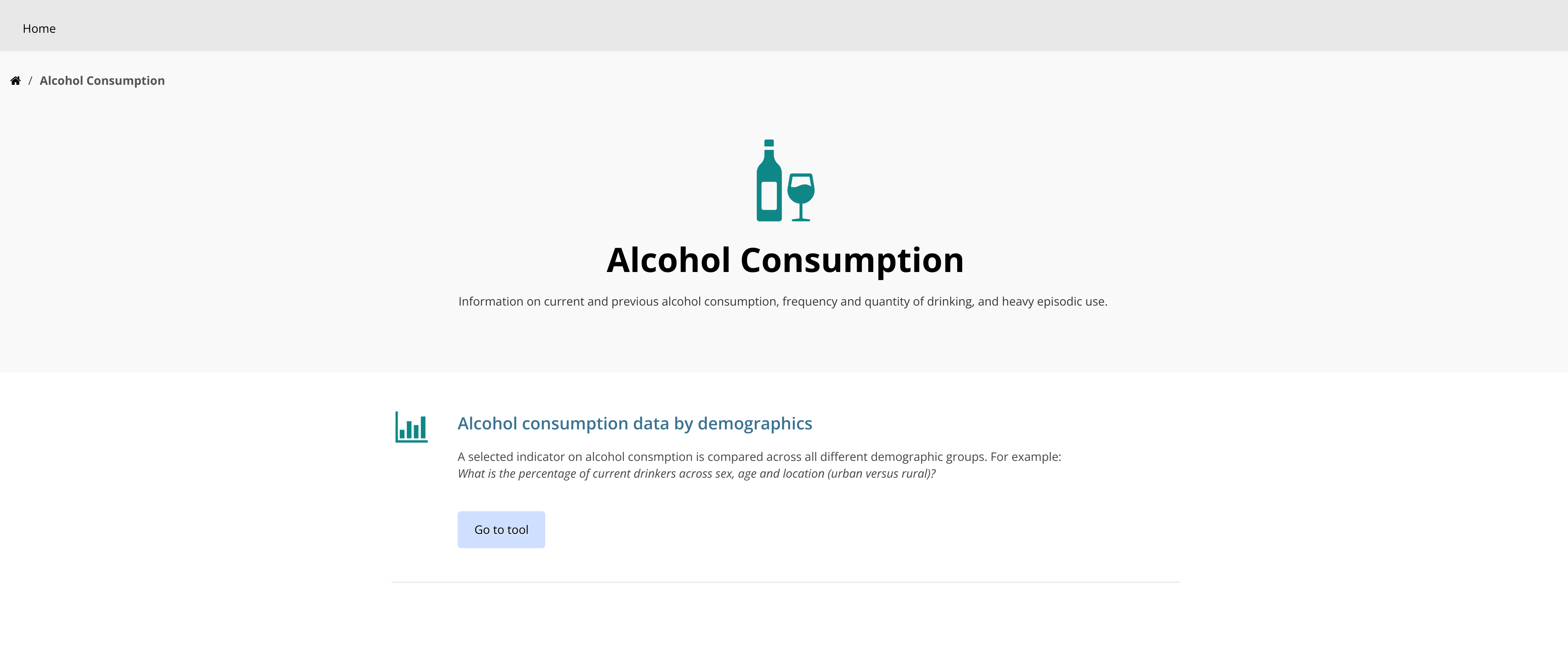
CKAN groups are used to organize Query Tools. Navigating to a group will result in the list of relevant Tools:

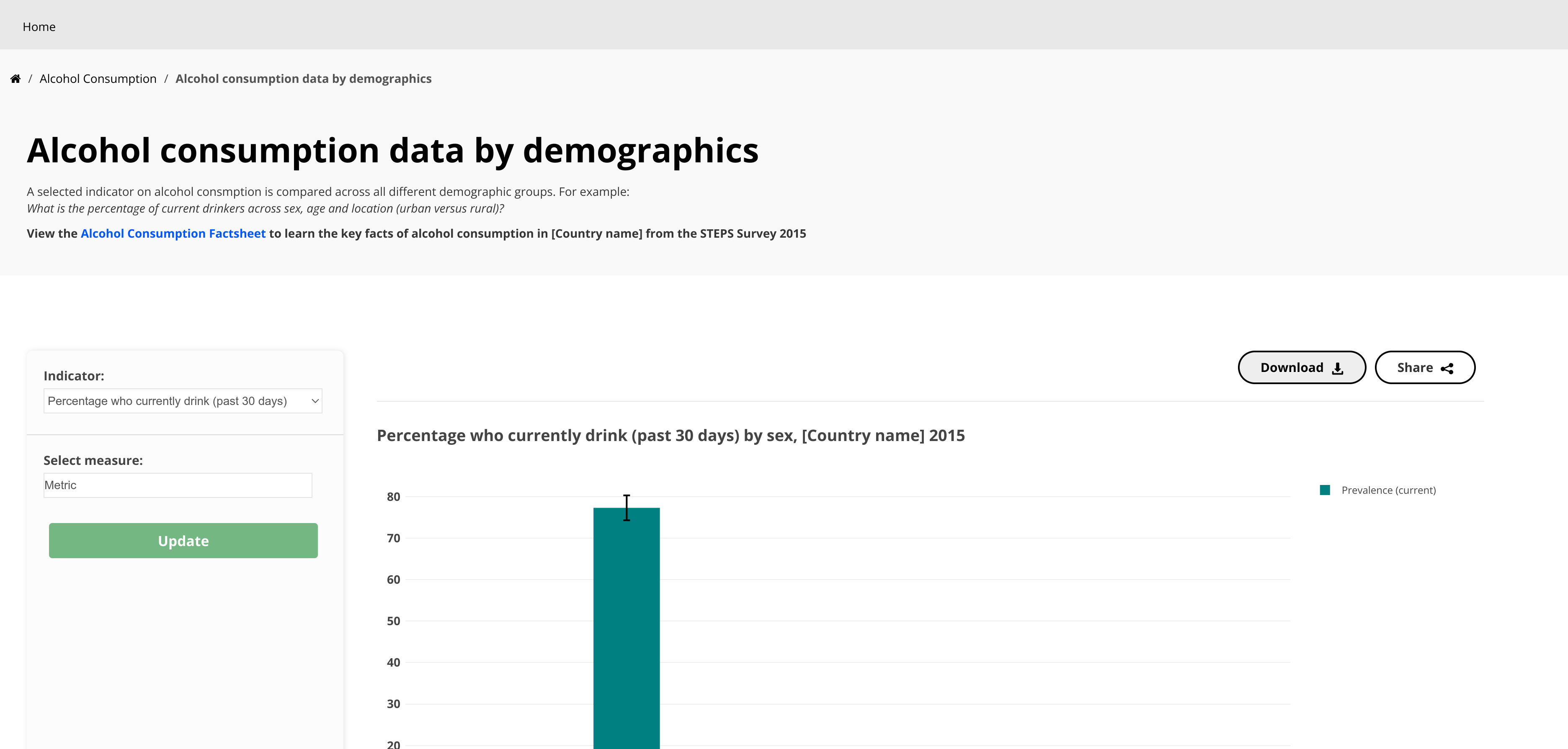
Finally, once a Tool is selected, its visualization dashboard is shown:


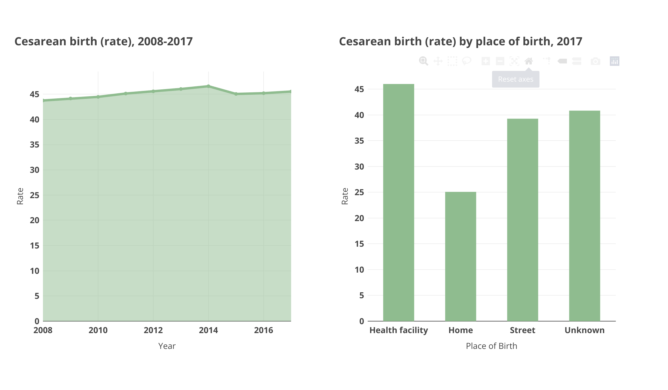
To handle the creation of visualizations and their dashboards, a few different (JS) libraries were used. In very early versions, D3 was used for rendering bar, line, and pie charts, but Plotly proved to fit the demands of the project much better. For maps, Leaflet was used, and DataTables handles tables.
There are a wide range of chart types. Admins can choose from bar, horizontal bar, stacked bar, stacked horizontal bar, line, area, scatter, spline, donut, and pie. As previously mentioned, maps and tables are also available. For each of these visualizations, multiple customization options were implemented in the UI.
On top of all of that, the project continues to evolve and improve, always striving to make the experience better for data consumers.
The outcome
The current iteration of this project makes it easy to share public health data visually. It offers a comprehensive list of options to clearly highlight the most important aspects of data. With clean and organized visualization dashboards, the experience as a public user is just as pleasurable as that of an admin.
What’s next?
For now, there’s no end in sight. Organizations continue to discover and choose this project. With a growing user base, there is no shortage of new features and improvements. The experience is consistently decreasing the time spent on achieving goals for both the admins creating the visualizations and the public users consuming them.
 Copy Link


